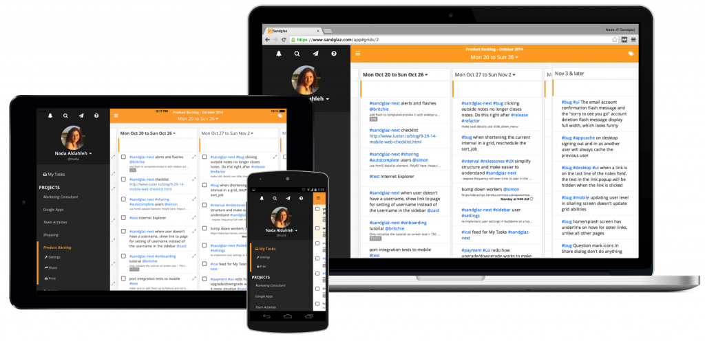
The all-new Sandglaz: Responsive, elegant, and more personal
Today, we're excited to introduce an all-new Sandglaz. It's simpler, intuitive and more personal. It seamlessly scales from the smallest mobile device to the largest monitor in your office. The new Sandglaz distills the best parts of its desktop and mobile versions into a single, beautiful, responsive app that loads faster, feels snappier, and can be viewed without an internet connection.
New design for all your devices
 When we started Sandglaz, we set out to create the simplest solution for managing your work, alone and with your team. Though we constantly hear feedback that you love the simplicity of Sandglaz, we thought we could do better and challenge ourselves to make the world’s most intuitive project and team management software even simpler.
The first thing you’ll notice is the vibrant and inviting design. Our goal is to have Sandglaz feel intimate and personal the first time you use it. We added Gravatar profile images to help anchor Sandglaz around you. We also reorganized the interface to clearly separate global actions from ones that are specific to each of your projects and tasks. This gives first-time customers confidence to explore more of Sandglaz and quickly gain an understanding of its power. Common actions are emphasized, while less common ones are sensibly tucked one click, or tap, away.
Even better, the interface looks and feels the same across devices while progressively showing more of your plans and milestones as the screen gets bigger.
View your tasks offline, anywhere
Starting today, you can view tasks without an internet connection on all supported browsers (Firefox, Chrome, Opera, Safari 7.1 and higher, Internet Explorer 10 and higher) on both desktop and mobile devices. Sandglaz makes use of the latest HTML5 offline technologies (AppCache, IndexedDB) to store all your data on your device. This also provides a faster startup time online and offline.
A new foundation
One thing we do exceptionally well at Sandglaz is customer support, and our customers have been telling us they appreciate this. They say few companies come close.
So what does this have to do with this announcement? Well, the secret lies in how we operate as a company. We take efficiency, both ours and yours, seriously. When a customer asks us how to accomplish something in Sandglaz, we treat it as a design failure on our part — we need to make it more intuitive so the next customer can figure it out with ease. This attitude results in fewer questions and a smaller percentage of our time answering them. This means we spend more time building our next great feature.
Similarly, having two codebases for desktop and mobile is not efficient for development and conventional wisdom says that running desktop code on a mobile device is slow. We’re not the kind of people to shy away from a challenge and we’re happy to share that we’ve unified our code without sacrificing performance.
In fact, it has allowed us to optimize performance in many areas. For example, we’ve brought Sandglaz on mobile and tablet devices to parity with desktops. Even better, we’ve thrown away almost half our codebase along with half our automated test suites.
We’re excited because this is a new foundation to get features and enhancements to you faster and with less effort. Of course, we couldn’t have done it without you and your continued support.
From everyone at Sandglaz, thank you.