Sandglaz Infinity - Now in public beta
We are thrilled to announce that Sandglaz Infinity is now in public beta. Signing up to Sandglaz will give you direct access to Infinity. Even better, it is free during beta.
We appreciate all the awesome feedback we got from all our users. You rock!
Looking back
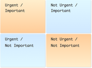
Sandglaz was inspired by Eisenhower’s matrix, a concept I came across years ago during a business course I was taking at university. I used an excel spreadsheet to apply it to organising my school work. Unfortunately, it didn’t last long—it was too cumbersome to maintain on a spreadsheet.
Years later, I kept on thinking about the usefulness of this concept, and its application to my work and personal life. I was managing a team at CIBC, and I was constantly searching for a simple web app I can use to share tasks with my team. Meanwhile, Nada was working as a Software Engineer and had strong opinions on how applying Eisenhower’s matrix to software development makes or breaks a product. She believes that if you have a successful product, you must have spent more time in the non-urgent/Important quadrant designing an elegant solid architecture and less time in the urgent/important quadrant firefighting with patches and broken code—whether you did it intentionally or unintentionally.

In addition to the Eisenhower concept, we both understood how critical the user experience is to the success of a product. These two ingredients are the origins of Sandglaz. Few months later we combined our efforts and started our journey. Since then, every discussion we had revolved around offering the most intuitive experience to the user. We focused on minimizing the number of clicks and keystrokes a user needs to do. It resulted in the drag & drop and the free-form task entry interface we have—the features most liked by our users.
We launched the private beta of Sandglaz Free in January, and went to public beta in April. Throughout it all we were using Sandglaz itself to plan our work. The beauty of it is that we can experience any usability pains before anyone else does. We are also obsessed with our productivity and efficiency, so any limitation we feel when using our own product turns into a creative process of brainstorming the most elegant solutions to it.
We are strong believers in iterative development and continuous improvement philosophies. Instead of assuming that humans can plan perfectly and behave perfectly, these philosophies embrace our limitations to help us work better and become better people.
In designing Infinity, we were embracing these ideals. We created a very flexible back-end and our biggest challenge was to expose it in the simplest, most intuitive way. We spent countless hours brainstorming and sketching UI designs for Infinity.
The result is a marriage of calenders and to do lists. Infinity allows you to break down your long list of tasks into manageable chunks. It allows you to think of your immediate priorities and at the same time plan towards your long-term vision. It embraces our imperfect nature by allowing us to plan in adjustable milestones.
| this week | next week | Later | ||
|---|---|---|---|---|
| < | > |
When first looking at it, the interface is a simple 3 column grid showing an overview of your project. On closer inspection, you notice the first two columns represent your current and next milestones, and you can scroll back and forth in time. The last column is an aggregation of all future tasks. As you explore further, you start changing your milestone dates, moving tasks between milestones and discovering Sandglaz’s task auto-management abilities. Sandglaz Infinity takes ideas that are considered for enterpises and simplifies them to be more useful, more pleasurable and more efficient.
After the launch of the private beta of Infinity in Sept, we continued to improve the concept, we also added tagging and delegation without increasing the complexity.
Today, Infinity is out. We will continue to improve on it, we will continue to iterate, and we will continue to bring the simplest and easiest tools to you. This is our promise.