Ultimate office layouts
Office layouts have evolved far beyond the open concept. A good office space needs a good balance of privacy and openness, of collaborative workspaces and quiet solo areas. Whether your office space is 300 or 30,000 square feet, you can always find something to improve in your office space. Maybe your team hasn't felt as creative in a while, they're having trouble staying focused and productive, or they don't seem that clear about your company's culture and what you stand for. All of these things are heavily influenced by your office space, and with a few tweaks you can increase your team's potential.
When it comes to a good office layout, the secret is all in the details. You don't need to be Google or Facebook to make your office space better, and you don't need a massive budget either. Sure, slides in the office are cool, but in the end it's not about that. It's about creating a space that is conducive to being creative and productive while also feeling at ease. Does that sound like your office? If not, then see how these ultimate office spaces have achieved all of this.
Mule Design
It's nice to come to work when it feels like home. The Mule Design office layout really has that homey feeling that you might want to strive for in your own office. Why is that desirable in an office? When employees come to a place that doesn't feel like 'work' (i.e. a chore, a daily grind) they are more likely to be open, creative and, why not, spend more time at the office.
The Mule Design office achieves all of this through the use of book shelves and multiple seating areas.
 Photo from Mule Design Blog
The big windows and the drapes also help make this office feel like home. Not only do windows make the office feel less like an artificial workspace (after all, how many rooms without windows does a home have?) but job performance is also highly dependant on light quality.
 Photo from Mule Design Blog
And to bring it all home (pun intended), the Mule Design office even has its own puppy, Rupert! Pets are therapeutic: they lower blood pressure and increase levels of dopamine and serotonin.
 Photo from Mule Design Blog
Birchbox
What makes the Birchbox office awesome is that it really carries the brand throughout. The NYC-based discovery commerce platform has chosen pink as its color and it's present everywhere in the office, from the employees' desks to the wall pieces.
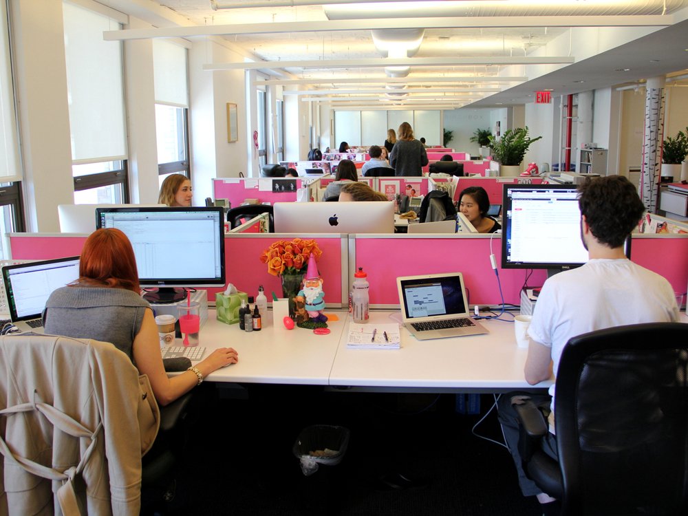 Photo by Daniel Goodman/Business Insider
What's more, the Birchbox office even has personalized art. How's that for carrying the branding through?
 Photo by Daniel Goodman/Business Insider
But branding is not just about the company's logo and color scheme. It's also about personality and values. If you walk through the Birchbox office, you can occasionally see the token pink sneakers, which each employee receives after they've worked with Birchbox for a year.
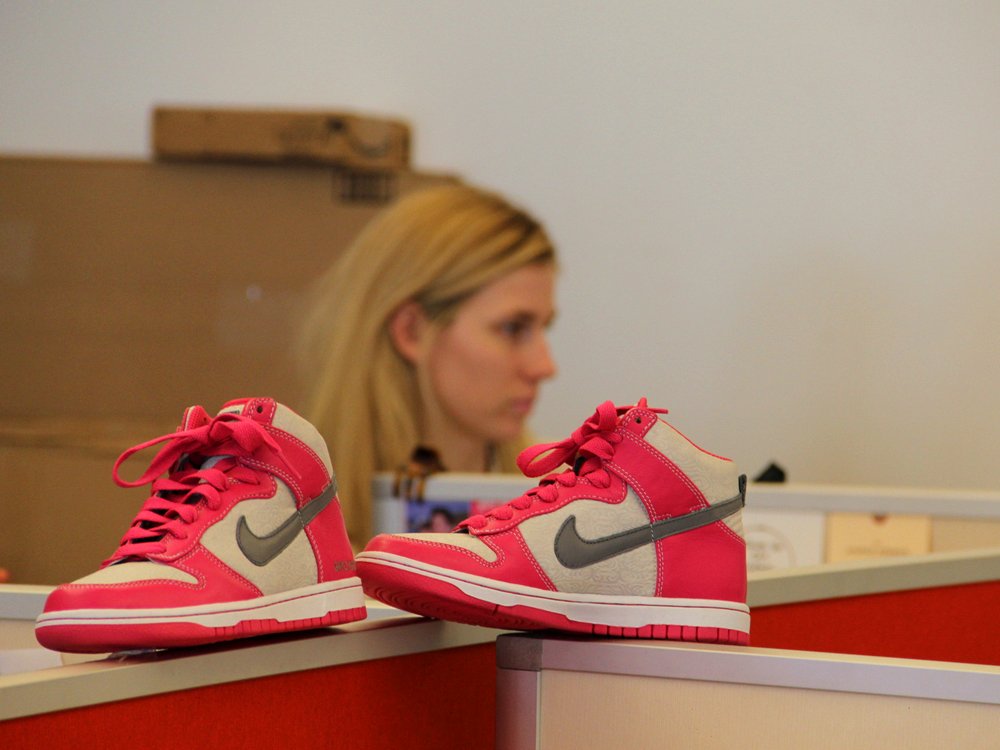 Photo by Daniel Goodman/Business Insider
And the employee of the month receives this pink-hatted gnome.
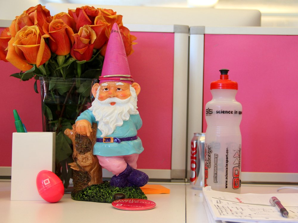 Photo by Daniel Goodman/Business Insider
Overall, the Birchbox office layout works really well because it combines design elements that showcase the company's brand with quirky items that represent its employees' personalities. It all works out to create a relaxed atmosphere where people can be themselves - which is what you really want in an ideal office.
Foursquare
Any good office layout should have different zones - for doing quiet work, for socializing, for working collaboratively, etc. But Foursquare's New York office takes zoning to a whole other level. Each room has a different design matching different badges that the app users would earn for signing in to places.
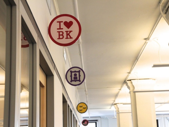 Photo from retaildesignblog.net
So if you need to have a team meeting, you might want to go to the Swarm Badge room.
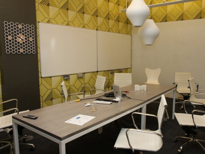 Photo from retaildesignblog.net
Or you might want to lounge in the Socialite Badge room.
 Photo from de zeen magazine
If you work best in the buzz of the office, you can stay in the main area, which sports both lounges and desk areas.
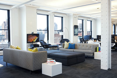 Photo from Design Milk
The best thing about the Foursquare office is that it takes into account different work styles. There are so many areas that no matter how they work best, Foursquare employees can find an ambient that works best for them.
Of course, not all companies have the resources to create an office layout like Foursquare. But any office can take small steps toward creating different zones by incorporating at least a couch and a stand-up desk, as well as separating the meeting area from the quiet work area.
ICRAVE
ICRAVE's office layout is all about collaboration. As an experiential design and branding studio, ICRAVE needs its employees to think outside the box and create together - and the space is certainly conducive to that.
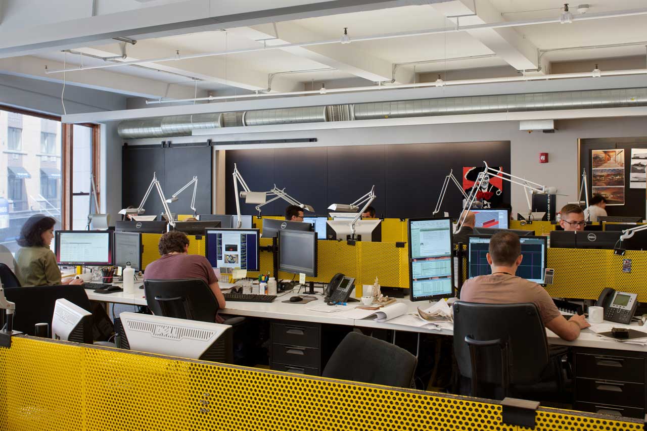 Photo by Design Milk
Since ICRAVE is a design company, no wonder they designed the space themselves. There's something to learn from this, as only you and your employees can truly know what you need from the office space. Even if you're not designers, you can still create an office layout that is functional.
What's more, the ICRAVE office maintains functionality throughout the space. The walls are covered by chalk boards, so teams can brainstorm and create in any area of the office.
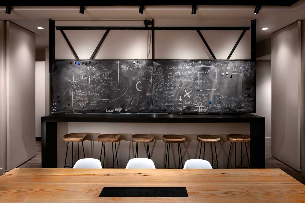 Photo by Design Milk
This chalkboard lifts through a pulley system to create a bar space with the kitchen. A perfect way to maximize space while creating an area for socializing and team bonding.
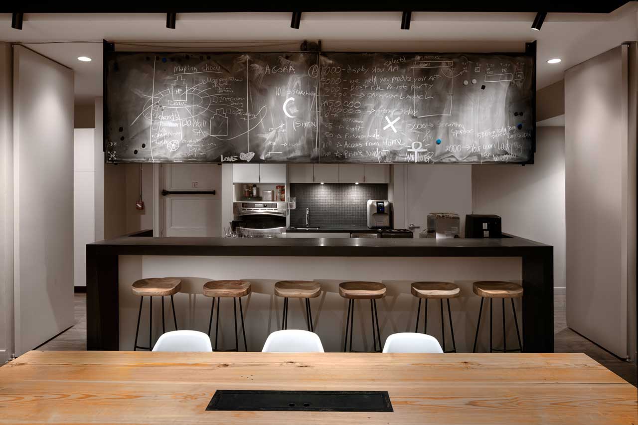 Photo by Design Milk
Maybe there's an area in your office that can serve a double purpose with a few adjustments. Can you think of one?
Even if your team might not have the resources that these companies have, you can still incorporate some of these ideas into your office layout. If it will affect your team's productivity, creativity and collaboration, it's worth it.
Need more ideas? Check out our post on maximizing a small office layout.
What are your favorite things about the offices in this post? What are some of your favorite office layouts? Share them with us in the comments below.